Kehoe Signs Website

Kehoe Signs approached me after a rebranding from Omega Graphics to include the name of the founders.
Their needs were very straight forward:
- Mobile friendly.
- An easy to use contact form.
- Connects with their Instagram account.
Their only branding was a hand painted wordmark that Frank Kehoe did above their storefront. I took a few photos and vector traced it so that it would scale well for digital use.
Tools used:
Logo vector traced in Adobe Illustrator CS. Photos edited with Adobe Photoshop CS. Website built on Wordpress.
Boomerang Boxer Logo


This client created a boxing training tool that is simple and compact. They had a name but needed a logo. In addition to creating the logo, I created a die cut template for the header cards and sourced a vendor to create woven lables to attach to the product.
Tools used:
Adobe Illustrator CS

[sic] Café Logo

This client came to be with a name of their podcast and needed a graphic logo to match. Two things they absolutely wanted was a coffee cup and to use a 'coffee' color palette.
I decided to incorporate the sic brackets and a coffee cup into the design. Many iterations included a two color logo but the clear winner was the single color graphic you see here. The outcome also included a subtle speech bubble inside of the coffee cup which the client loved.
I helped the client source a natural / fibrous cardstock and worked with the printer to ensure a perfect color of print was achieved.
Tools used:
Concept sketched with pen & paper. Vector traced with Adobe Illustrator CS.
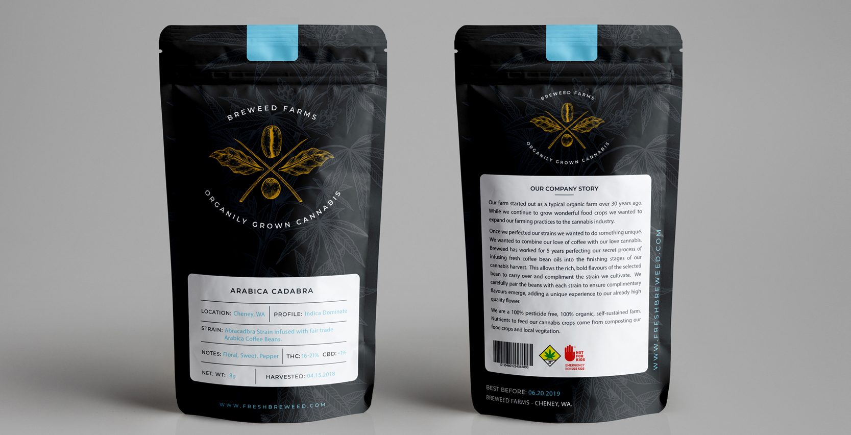
Fresh Breweed Package Design
FRESH BREWEED
The client needed package design done for their product line using their existing logo & branding elements.
The must-haves:
- An easy-to-use template for the body of the package.
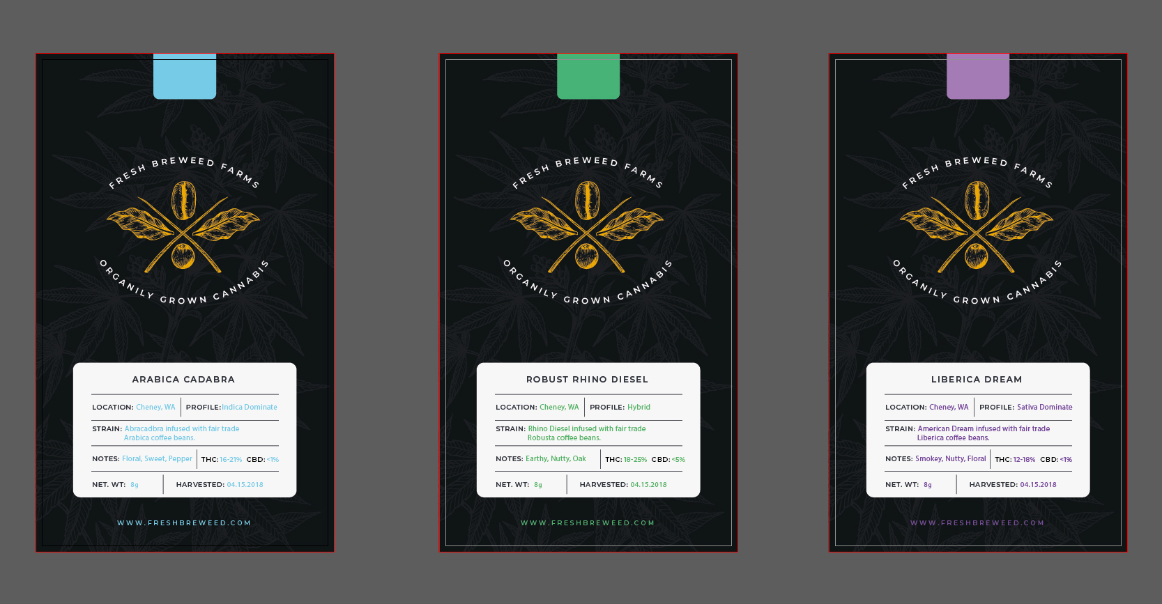
- Three colors to represent the each of the three categories of cannabis they grow.
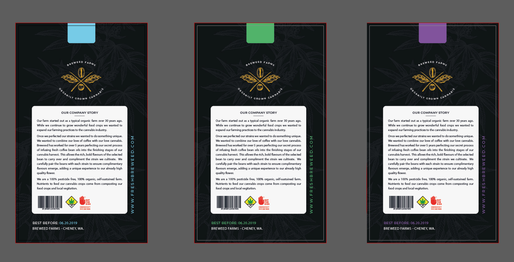
- Ensure the design complies with Washington State cannabis label laws.
- No overt marijuana imagery.
I designed this in two pieces: The body of the packaging and a label template for the front content. I started by finding 3 complimentary colors to their primary logo color for the categorization of their product. I used a subtle illustration of a cannabis plant as a background / texture element. I used the same categorization colors for the dynamic content found on the label. The label has to be produced on demand because the levels of THC & CBD vary from harvest to harvest and the law requires that the information be accurate on every batch.
Tools used:
Vector assets created / edited in Illustrator CC. 3D mock-ups created in Photoshop CC.
Accent on Styles
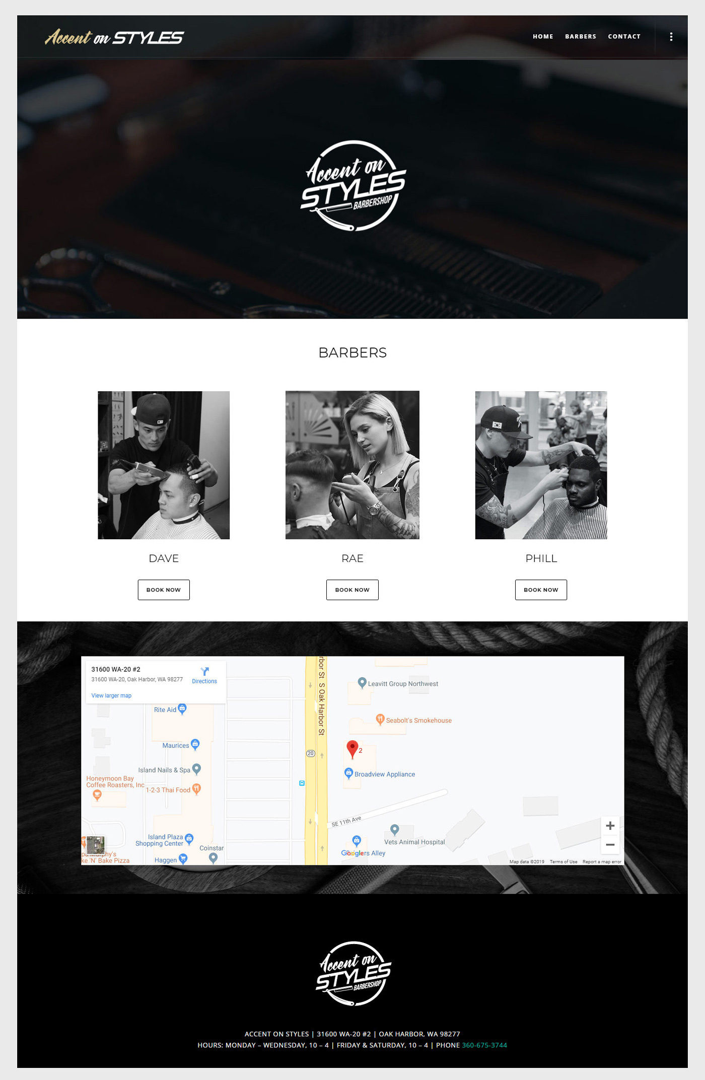
This client bought an existing salon and wanted to turn it into a proper barbershop. I was tasked with designing a new logo using the old name. They wanted a simple and modern look to the design as they wanted to separate themselves from the previous incarnation of the shop. Their target audience was 18-30 year olds whereas the previous salon catered to 40+ women seeking typical salon services.
The only requirement of the website was it needed to connect with Square Appointments so that each barber could manage their appointments from a phone app and that the was mobile friendly.
Tools used:
Logo created in Illustrator CS. Photos edited with Photoshop CS. Website built on Wordpress.


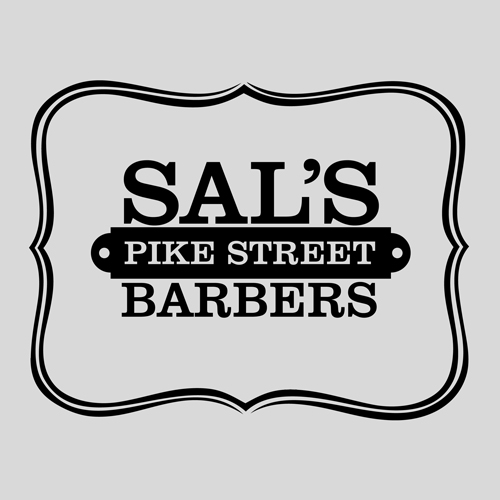
Sal's Barbershop

Sal's has been in business for nearly 20 years. They never had any definitive branding and finally wanted to see that changed. They wanted a very simple "old school" logo, preferably with some hand drawn detail elements to it. I used pin striping style linework to frame a bold wordmark.
Tools used:
Concept sketched with pen & paper. Vector traced with Adobe Illustrator CS.
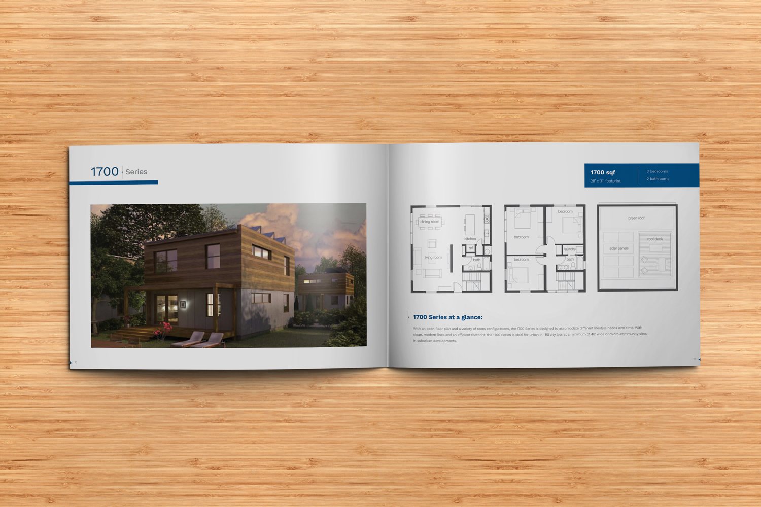
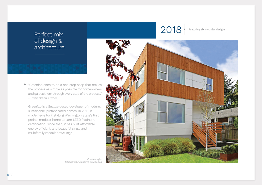
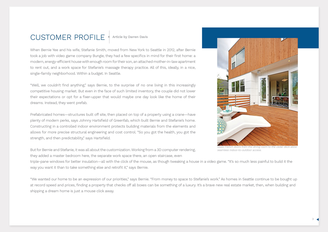
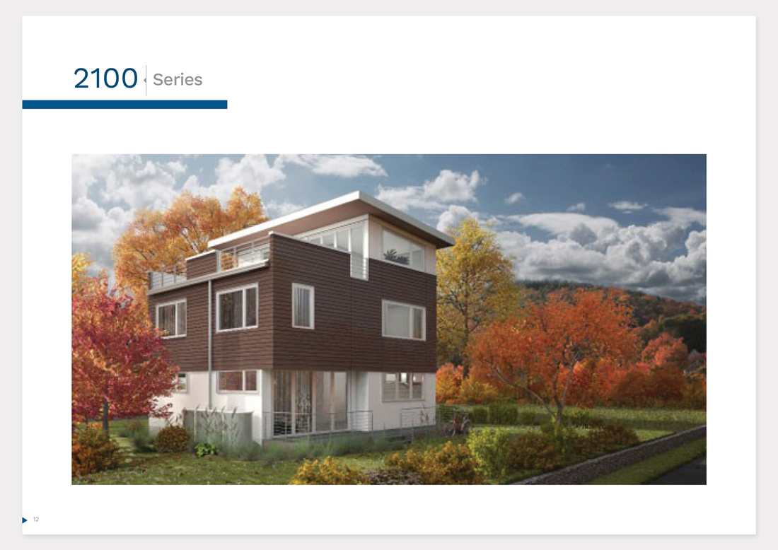
Greenfab Printed Catalog
Summer Catalog
Greenfab needed an brochure designed and printed to showcase their new designs for an upcoming open house event. They wanted to feature a customer profile in the brochure and they insisted that the display of information for each design to only span two pages.
Tools used:
Built in InDesign CC. Photos edited with Photoshop CC.
Seattle Super Font

Custom Font Creation
I was tasked with creating a custom font based on the 2001-2008 Seattle Super Sonics logo.
As with most classic logos, it was hand drawn and only included the necessary letters. I started by finding the closest basic font to build from which was the sans-serif BebasNeue. I scaled that font and added stroke until the body filled out to the size and scale of the existing letters. I determined the size of the serif and added those to each of the letters. Finally, I created a centerline stroke inside each of the letters to complete the look.
Tools used:
Created entirely with Adobe Illustrator CS.
Washington Typography
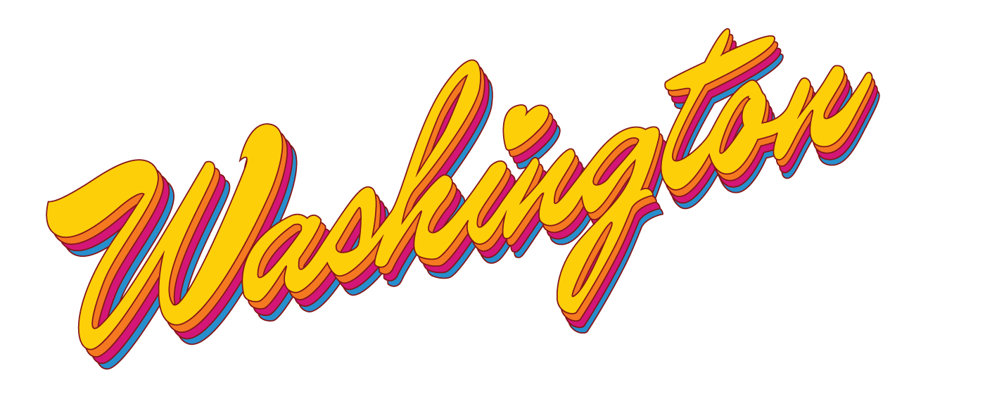
Client wanted a custom bumper sticker created featuring Washington in text. I went for a retro hand drawn style lettering and used a vibrant color scheme.
Tools used:
Concept sketched with pen & paper. Vector traced & colored with Adobe Illustrator CS.
Unauthorized Prints

This website was created to help educate the customer as well as streamline the ordering process for them and the shop owner.
The biggest visual requirement was integrating the instagram feed on to the home page so the content would update every 24 hours.
The most pivotal task was creating a quote form that gathered as much information as possible from the client without discouraging them throughout the process.
The quote form went through many sessions of A/B testing in hopes of reducing form abandonment. The end result was a 26% drop in abandonment rates and increased customer conversion rates by 11%.
Tools used:
Photos edited with Adobe Photoshop CS. Website built on Wordpress.
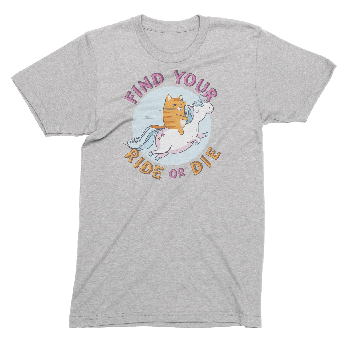
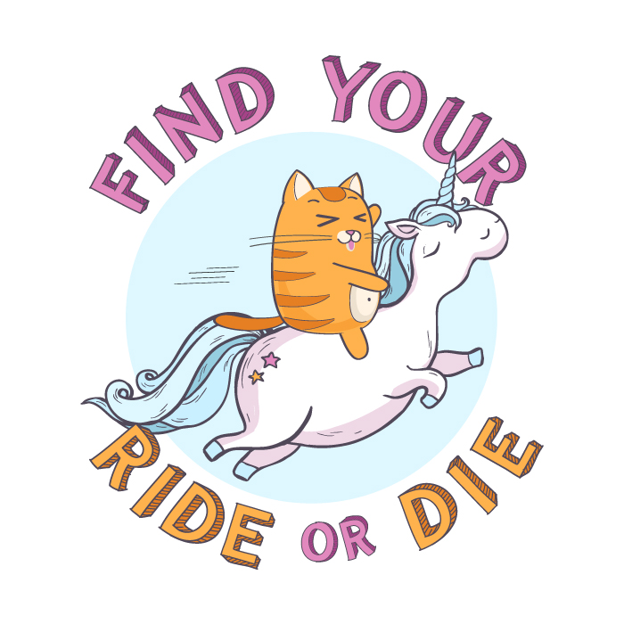
Ride Or Die Tshirt
This was created for a t-shirt design competition. The theme was "best friends".
Illustrated on paper then brought into Adobe Illustrator to add clean bold lines, color, and created the text. While I did not win, I was very happy with the result and printed stickers and t-shirts of the design on my own.
Tools used:
Concept sketched with pen & paper. Vector traced and colored with Adobe Illustrator CS.
Mount Rainier Sweatshirt

This is one of many designs I created for a local PNW themed clothing company. Using a few of my photographs of Mount Rainier as a reference, I created this design using a single line illustration style.
This design was done 100% digitally. Photoshop for the layout and concept & Illustrator for the final illustration.
Tools Used:
Nikon D5600, Adobe Photoshop, & Adobe Illustrator.
Pacific North West Graphic Tshirt

Client wanted a graphic that could be used on both a tshirt and stickers.
Rough layout on paper but otherwise created in Adobe Illustrator.
Tools used:
Concept sketched with pen & paper. Vector traced and colored with Adobe Illustrator CS.
Bald Eagle

Bald Eagle looking up at a harrassing crow.
Low-key photography in nature is my favorite way to shoot a subject because
it gives the viewer the impression you shot this in a studio.
ISO 400, f8, 1/1200
Tools used:
Nikon d850, Sigma 150-600, post processing with Lightroom.
Anna's Hummingbird

Anna's Hummingbird feeding on Delphinium
Low-key photography in nature is my favorite way to shoot a subject because
it gives the viewer the impression you shot this in a studio.
ISO 400, f8, 1/2500
Tools used:
Nikon d850, Sigma 150-600, post processing with Lightroom.
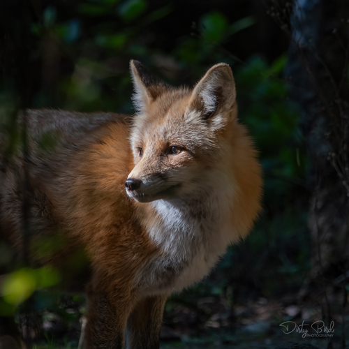
Red Fox

The lighting was difficult in the dense forest and I was shooting hand held.
ISO 3200, f6.3, 1/60
Tools used:
Nikon d850, Sigma 150-600, post processing with Lightroom.


